
Applying for a job is a sales action. You are the product. The pitch is the skill set you offer that solves a real business problem. You need a personal brand.
- Recognizing That I Am The Product
- Do I Even Need A Logo?
- Background Research Creates A Path to Follow
- Conducting Proper Due Diligence Is A Must
- Finding Meaning Beyond Just Looking "Cool"
- Detours That Helped Me Decide
- Finding the Final Design
- The Brand Behind the Logo
- How I Plan to Use This Logo
- What I Learned During the Design Process
- Where Do I Go From Here?
Recognizing That I Am The Product
This realization became the primary reason I decided to start a personal brand website. It dawned on me that in order to showcase my work as a marketer, the best test case is to start with myself. If I can draw attention to who I am, what I can offer, and how effective my methods are, I stand a better chance at convincing others that I can do the same for them.
After years in marketing, I knew the limits of a well crafted resume, a thorough portfolio, a polite interview, or a hopeful phone call. Those methods may be time tested, but they can be inefficient if you are trying to place yourself in the right role or grow new opportunities. Think of the hiring pool as a child’s puzzle board where you are the shape trying to fit into the perfect space.
You might fit into a space, albeit imperfectly, but over time you eventually conform to the demands the position requires. In other cases, you may never feel that you are the right fit for the job. Or, worse still, you bring a vast array of skills and knowledge only to find yourself using just a fragment of what you can offer because there’s no use or need for anything else. Unfortunately, the longer you stay at those jobs, the greater the chance that those unused skills will dull over time or become obsolete.
These are familiar scenarios that I have personally encountered. It’s not something that I consider unique to me and happens more often than most people realize. Rather than accept only the sources provided by job boards, I have resorted to expanding the field of opportunities that I can tap into.
And so the motivation to build a personal brand website was born. Once I recognized my needs for personal development, a mental path was forged. If I am the product, then I need a brand that shows competence through experience, reputation through references, expertise through tangible work, and character through consistency. Marketing taught me this lesson; I just had to reflect that knowledge back on myself.
Do I Even Need A Logo?
Do you need a personal logo? Does anyone? Not always. But once I decided to move into a phase of championing myself as the product, adding a logo felt like the next logical step. It would force me to distill what represents “me” into something more personal and substantive than merely a visual ornament.
My criteria had only a few rules: keep it simple, give it meaning, and let it communicate a message that stays relevant over time. Think of the symbols and brands you have seen for years. You might not know their origin stories, but once you do, the mark feels deeper. That was the bar I set when I decided to create my own.
Background Research Creates A Path to Follow
There are many resources now that serve as useful guides to the branding process. Although I have years in marketing, most of that work sits in the narrow lane of entertainment. Marketing a service can be very different from marketing a product. If I went in with only what I know, it would be sheer arrogance on my part to assume I already have all the answers. In my previous post, “Thinking Beyond Traditional Marketing: Learning to Adapt,” I make it clear that you never stop learning.
Whether the advice comes from industry titans like Marty Neumeier or a talented designer in their twenties, what matters most is the substance of what they share. The real skill is absorbing these different viewpoints from people at various career stages who are masters in their chosen field. Take what they teach and assimilate what you can for your own needs.
I watched a video on YouTube called “Why Ugly Logos Cost More?” produced by the channel Flux Academy. The topic focused on why brand agencies can charge substantial prices for designs you might consider simple. Branding goes beyond creating a set of concept art examples to show a client. There is a thought process behind the pixels. Agencies dig through history, culture, and language to avoid missteps. They test color psychology, packaging designs, scale, context, and advertising media. From there, they apply pressure testing to make sure the brand holds up anywhere.
This is why a logo matters. It builds a reputation. It becomes a shortcut for value. When you hear Mercedes, Nike, or Coca-Cola, the symbol flashes in your mind before the copy does. That is earned equity, not decoration.
Conducting Proper Due Diligence Is A Must
A quick, personal story from the industry. For a short while after being spun off from the Clear Channel brand, the companies that formed the concert division of Clear Channel Entertainment began operating under their regional names until a new company name could be created. An email landed in my inbox announcing the creation of Live Nation. The first thing I did was type the name into a browser, which took me to a porn website. The domain was not secured yet. It was fixed within days, but the lesson stuck. Details matter.
A good branding process protects you from avoidable, very public mistakes. Fortunately, that episode never became public knowledge and the company was able to launch its new name without further incident.
Finding Meaning Beyond Just Looking “Cool”
There is more to a personal brand logo than stringing together letters or crafting a symbol and hoping for the best. My brand name is my name, so that part came easy.
My design process began with something familiar and common, the use of my initials K and T. I tried slants, ligatures, negative space, and a few sharp geometric forms.
While trying to come up with a basic design, I would check sites like Pinterest and even Google images to see what other designers made. There’s nothing wrong with emulating an existing design if you think you can make it work for yourself. But I needed more than what those styles could offer.
My symbol needed meaning. I did not want the story to be, “I chose it because it looked cool.” People respond to origin stories because stories help them remember you. Meaning creates memory.
Some looked clean, but none felt like me. They said “typography exercise,” not “Kerry.” So I pivoted away from letterforms to something more abstract that could hold a bigger story.
My Three Design Anchors
To find the story behind the logo, I anchored the concept to three parts of my life:
- Past History: years in the music industry, where rhythm, reverb, and the rising roar of a crowd provided the basis for my work experience.
- Personal Origins: born in Trinidad and Tobago. I have not been back in years, but those early memories are never far from my thoughts.
- Escape and Horizon: my place of solace. Think white sand and palm silhouettes, complemented by golden and vanilla sunsets. Separate places woven into an idealized paradise for mental refuge.
Those three anchors gave me direction. My personal logo should pay homage to music, a memory, and hope.
Detours That Helped Me Decide
The path toward a final design branched into several directions that ultimately became dead ends. I explored a ticket stub that felt relevant to concerts and events, but that only represented my career.
I tried circular marks for balance and a timeless feel, but a few iterations drifted too close to the Pepsi logo. Avoiding a potential legal situation with an international conglomerate due to a trademark violation is one of those stress tests you consider in design. That sent me hunting for a different geometry.
Then I drew a wave.
At first, it was a sketch of a sandy beach horizon with a palm tree where the ocean meets land, capped by a rising or setting sun. The curve reminded me of a waveform, which played to my music background, though that was not apparent in the early designs. It was a convenient coincidence that only registered once I saw it on paper.
I went further and experimented with different sizes, combinations, and patterns. In the back of my mind, I still felt the early designs were too complex, so I began reducing the shape and form. I stripped out color and planned for only two versions: one for a black background and one for a white background. I also tried connected lines that created an infinity symbol, or a slanted figure eight, then simplified again. These concepts still did not feel right, but I knew I was getting closer to the kind of design I wanted.
Finding the Final Design
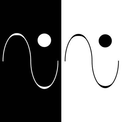
Eventually, I settled on a single waveform with a circle placed just to the right of the upper crest. It reads as a sound wave. The upper crest would represent the rise of landmass and the lower curve as ocean. The circle represents the sun. I also saw something I did not plan for.
Another happy outcome gave me a tagline even though I had not planned on having one. In fact, the meaning I originally planned for took on a different interpretation. Visualize the circle as the head of a figure, and the waveform can be the upper arms of someone in a running pose.
Here I was able to add a tagline that I felt came naturally: A new day to keep moving forward. That sentence is a compass. You can feel the discipline in it. There is optimism without pretending it is easy.
Here was a design that could scale on a business card, a header, a slide, or a website. No fragile lines. No dependence on color to make it work.
I believe this design pays tribute to my time in music through the waveform. It taps into my origins growing up on an island nation, and it suggests motion without shouting.
The Brand Behind the Logo
A logo alone is not a brand. It is a doorway. What you place behind that door is the brand:
- The work you choose to show
- The tone you use when you explain your process
- The story you convey in public statements
- The consistency of quality you deliver
- The relationship you build with your market
The logo creates an invitation. What your guest finds once they are inside is the substance they will remember.
How I Plan to Use This Logo
On my site, the logo will live in the header. In a portfolio deck, it will sit at the beginning, a curiosity to be spoken about, opening a path towards conversation. On documentation, it will become a visual seal that acts as official invitation for people to review the contents contained within. It will also appear at the end of a footer or a signature; a professional goodbye to the reader. On photos and videos, it will serve as a signal of authenticity. For all communications, it will carry the weight of my reputation.
What I Learned During the Design Process
Creating my personal logo taught me more about the importance of a mark. Though I consider the exercise academic, it sharpened how I approach client and company work. I know the questions to ask. A few lessons:
- The first clever idea is rarely the one you settle on. But it does create a starting point that gets the creative juices flowing.
- Meaning beats novelty. The cool factor might be subjective, but a true story sticks.
- Restraint is a tool. Too much can bury the idea you want to communicate.
- A clear process sharpens focus. Defining anchors, setting constraints, iterating, testing, and then committing helps avoid chaotic thinking.
Where Do I Go From Here?
The version I have settled on feels right. I may refine a curve or adjust spacing, but the shape and meaning will remain. The logo connects my history, my present and past skill set, and the future I am running towards without fear. It reminds me to show up and to keep moving forward.
If you decide to build your own logo, make it personal and honest. The shape does not need to be so unique that it drifts into the territory of a museum art piece. The story you want to tell should guide its design. If you can share that story in a few short sentences, then it already works. That is what a good logo does best. It opens doors and invites people into something real.